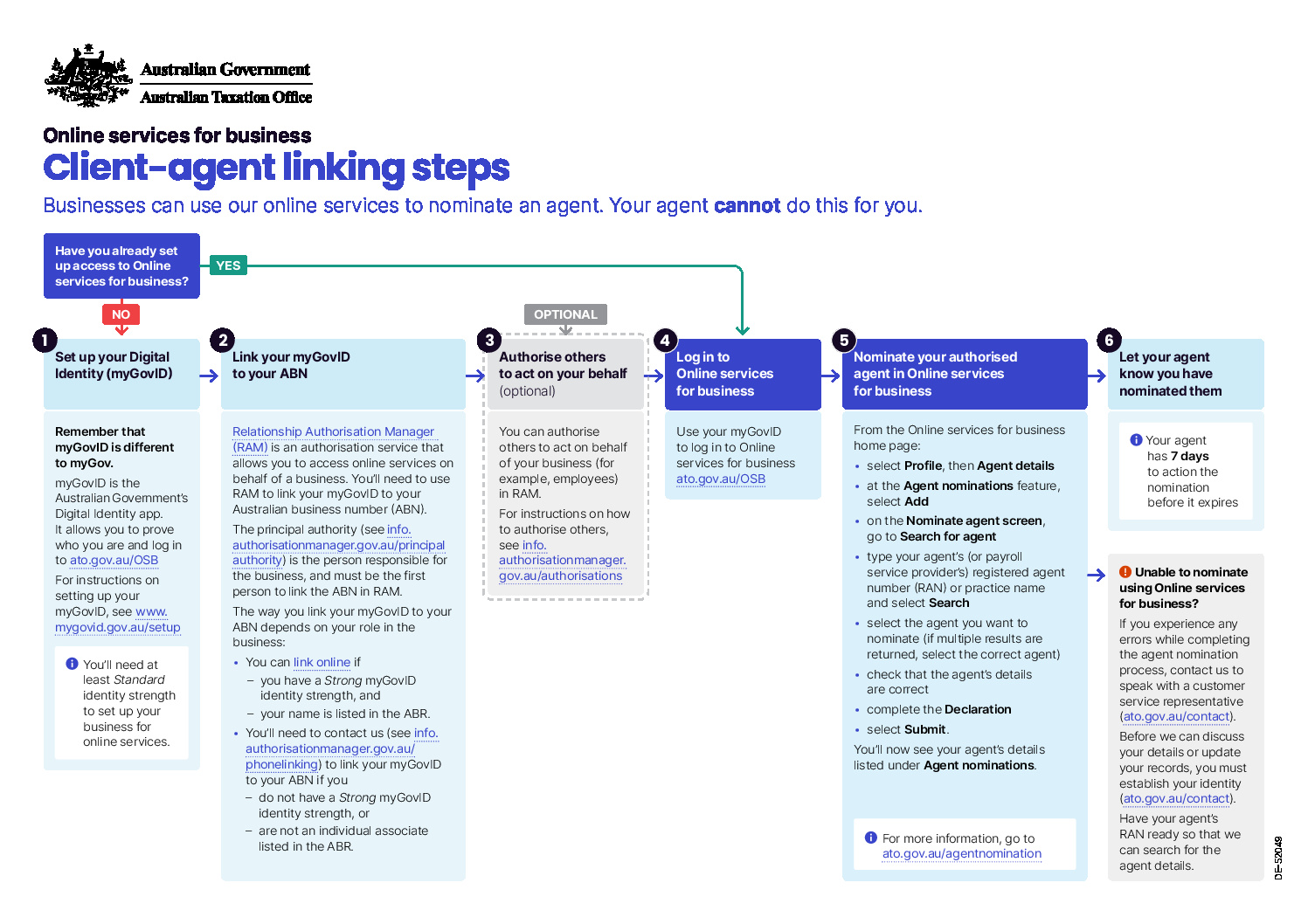

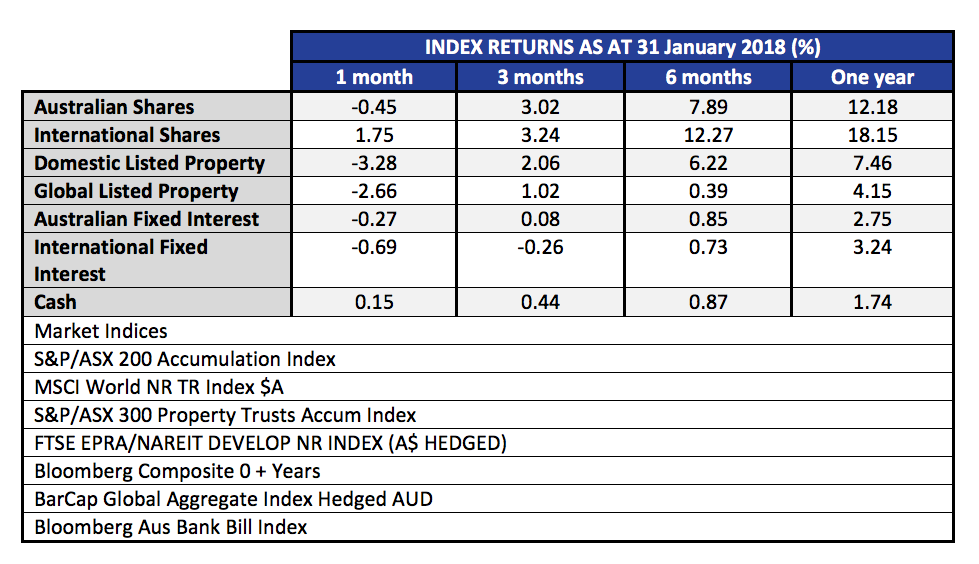
The month of January was relatively benign. Australian shares fell a little, and with the falling Australian dollar, international shares did fairly well for the month. Below we publish the 12 month rolling returns. Listed property, (local and global), was down on the rising interest rate curve.
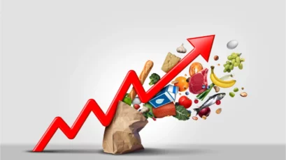
The real story that everyone wants to know about is, what happened in the first week of February, and what does that say about the rest of this year – and indeed the stock market outlook? First up, it is worth taking a look at the charts to visualise what happened.
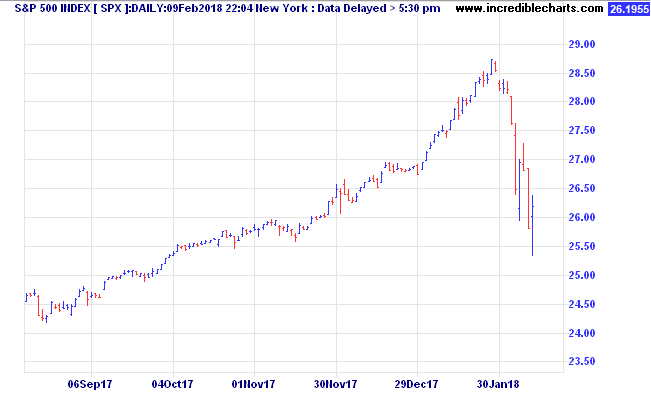
In the US market, the best index to watch is the S&P 500 Index.This is a much broader measure of stock prices, covering the 500 largest companies, versus the oft quoted Dow Jones Industrial Average (DJIA) which covers only 30 stocks, and is measured by assuming ownership of one share of each company, adjusted for splits and additions (it’s complicated).
Anyhow, from the high on Friday 26 January, to the intraday low on Friday 9 February, the S&P 500 lost 11.83%. (In the same period the Australian market was -4.36%) A 10% fall qualifies as the first ‘correction’ of the year, and follows a very benign 2017, when the steepest peak to trough loss for US shares was in the order of 3%. In the space of 10 trading days, all of the gains of the last two months were reversed. In that context, it is actually no big deal. Traditionally we expect a peak to trough loss of at least 10% in most years. This year it just happened early, happened fast, and followed a long period of stable markets, where complacency had become widespread. In fact, 2017 was so stable, in Australia we had the lowest number of daily moves of +/- 1.00% since 2004.
The real story behind this decline (aside from the usual finger pointing at algorithms, and portfolio insurance) is the rapid rise in the US long term interest rate curve. Below we show a six month chart of the US ten year bonds yields.
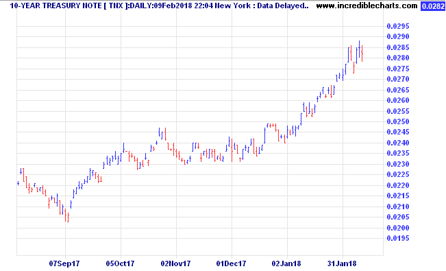
Notice that during January, the US Ten Year bond yields were accelerating up out of the 2.4% to 2.5% range, towards 2.85%. The rot started to set in on Friday 2 Feb, when the yields jumped from 2.78% to 2.85% on the positive US jobs report. Note that important point. Good news is bad news! IE; economy improving, jobs up, but that theoretically brings inflation and wages growth, and higher borrowing costs.
At present, rising bond yields combined with falling stock prices are a double whammy for what was once a staple of investing, the 60/40 portfolio where 60% was in shares, and 40% in bonds. With lifetime low yields we at Quill Group have been positioned to avoid long interest rate duration in the bond (fixed interest) part of our portfolios. While on the topic of bond yields, it is worth taking a look at the last 30 years of US Ten Year bond rates.
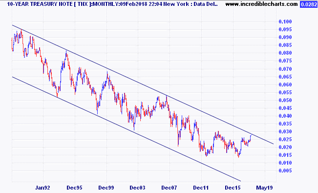
Note the clear downtrend channel that we have been in since 1982. (chart data is since 2000, but the peak was in 1982).
It is very important to understand the effect those falling interest rates over 35 years have had on asset prices. Now we appear to be on the cusp of breaking out of that downtrend. As you might well realise, this is potentially a very important juncture in history. It is for this reason that we think that volatility has made a violent return. It’s not every day that 35 year trends reverse! Higher interest rates mean valuation models are readjusted to take into account that the risk free rate of return (generally accepted as the ten year government bond rate of the country of the asset being valued). When the risk free rate is higher, the rate of return required to take equity risk is also higher. If cashflows (profit) cannot also be expected to rise (will the higher interest rates undermine any improvement in top line through an improving economy?) then the current value of those future cashflows gets marked down.
So, what does this ‘correction’ portend? Is it just a ‘cleansing pause’ or the start of a longer term decline? To be honest, no one can know for certain. Yes the talking heads will strongly argue whatever is their view. The vested interests will tell you to stay the course. The conspiracy theorists will say this is the beginning of the end.
What we do know is this. Returns going forward are likely to be lower than in the past. Our outlook for benchmark equity indices over the five to ten year horizon is well short of double digits. To get a double digit return we believe you will need to employ active management at a stock level, and an asset allocation level – which is something we seek from our investment partners.
So, what is the most likely outcome? As mentioned, valuations are elevated compared to history. However, we don’t see enough pent up demand from consumers or tight enough labour conditions to see inflation becoming a real problem yet.
Bear markets, which are defined as a market decline of 20% or more, are normally accompanied by a recession.
In that respect, global growth is on track to be more synchronised this year than in any of the last 36 years. In the US, they are looking forward to lower corporate taxes, and the spending on wages and investment which should follow. Indexes of purchasing managers intentions in all the major regions are nowhere like indicating any sort of slowdown in the economy.
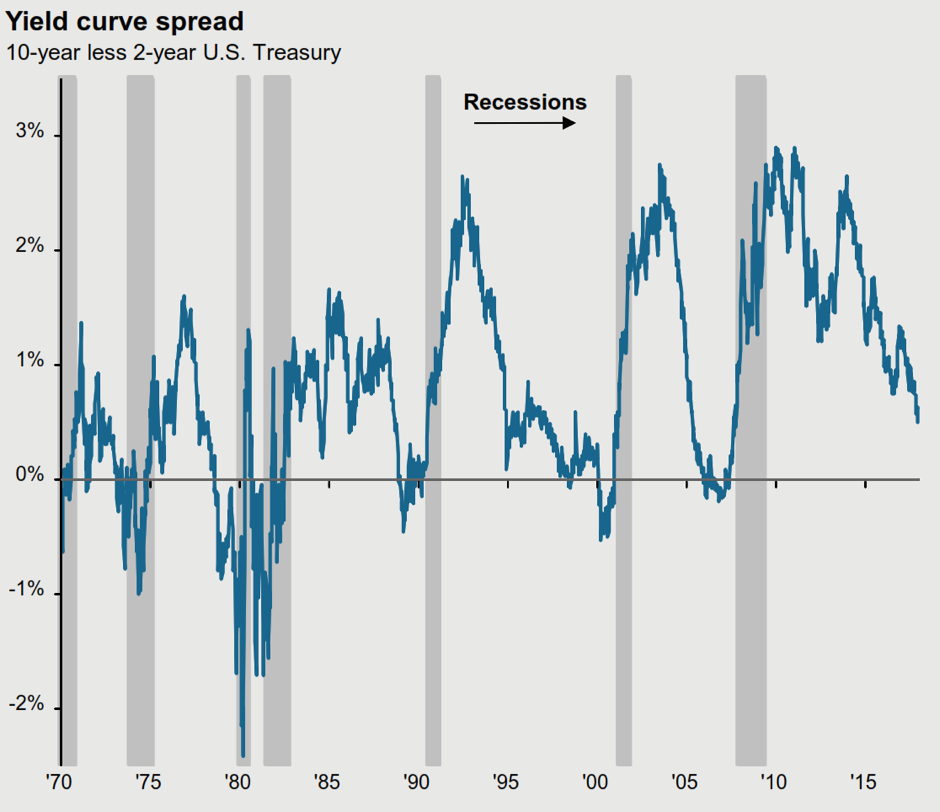
The yield curve is also an early warning signal of a recession. Leading into the last seven recessions in the USA, the ten year bond yield has dropped below the two year bond yield every time.
Today the bond yield is certainly flatter – but is not yet near an inversion. The current US two year bond yield is 2.07%, and the ten year is 2.85%.
The chart below from JP Morgan illustrates the ‘gap’. If history is still a guide to the future (and granted, it may not be) the peak in this bull market may still be more than a year away.
The same source, (JP Morgan) also points out that the average time from ‘yield curve inversion’ to stock market peak is 10 months. The shortest period was 3 months (in 1980) and the longest was 19 months (in 1988).
In the USA, over the last 90 years, there have been 10 bear markets (falls of greater than 20%). Eight of those were accompanied by recessions. Only the ‘flash crash’ at the time of the Cuban Missile crisis in December 1961, and the famous ’87 crash had no ‘recession’ trigger. Although painful, (1962; -28%, 1987; -34%) they were short, both over within 6 months.
Given the history, and that we see no recession triggers on the horizon at present, we believe the market will find a bottom sometime in the next month or two, and then continue to grind higher over the course of the year.
However, it is also impossible to completely discount the risk of a deeper flash crash, especially with central banks looking to end their massive liquidity injections.
As a result we caution against being too aggressive on buying the dips, and also warn against over-leverage in these conditions. A portfolio with well thought out diversification across the major asset classes as well as alternatives, will still deliver the best results in the medium to long term.