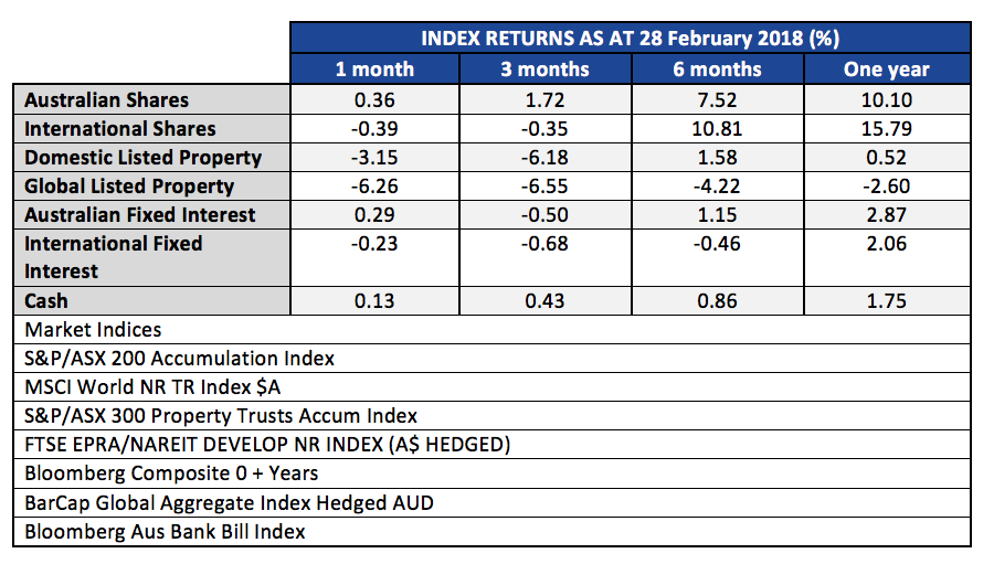
The S&P/ASX 200 Accumulation Index continued an upward march in July, gaining 1.36% for the month, and up 14.56% for the rolling twelve months.
International share markets continued higher, in spite of trade war threats and a rapid rise in the USD. Global shares for Australian investors gained 20.80% for the last twelve months.
The Australian Real Estate Investment Trust (A-REIT) sector moderated in July, but was still up almost 1%. The sector is also cycling to a decent 12 month gain of 14.45%. Remember, this is listed trusts in retail, commercial and industrial. Residential prices are another matter altogether which we will comment on shortly.
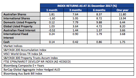
| INDEX RETURNS AS AT 31 July 2018 (%) | ||||
| 1 month | 3 months | 6 months | One year | |
| Australian Shares | 1.36 | 5.81 | 6.18 | 14.56 |
| International Shares | 2.52 | 5.48 | 7.50 | 20.80 |
| Domestic Listed Property | 0.95 | 6.32 | 7.49 | 14.45 |
| Global Listed Property | 0.93 | 5.28 | 3.93 | 6.46 |
| Australian Fixed Interest | 0.16 | 1.33 | 2.13 | 2.99 |
| International Fixed Int | 0.02 | 0.55 | 0.77 | 1.50 |
| Cash | 0.19 | 0.52 | 0.95 | 1.83 |
| Market Indices | ||||
| S&P/ASX 200 Accumulation Index | ||||
| MSCI World ex Aust TR Index $A | ||||
| S&P/ASX 300 Property Trusts Accum Index | ||||
| FTSE EPRA/NAREIT DEVELOP NR INDEX (A$ HEDGED) | ||||
| Bloomberg Composite 0 + Years | ||||
| BarCap Global Aggregate Index Hedged AUD | ||||
| Bloomberg Aus Bank Bill Index | ||||
Fixed interest and cash was modest over the month, with the paltry 0.19% gain in cash being the biggest return. For the rolling 12 months to 31 July, Australian Fixed Interest at 2.99% was the biggest gainer in the defensive end of portfolios.
Last month we commented on the market fascination with the FANG stocks, Facebook, Amazon, Netflix and Google. We pointed out that those four, along with Apple and Microsoft, contributed 30% of the S&P500 gains through 2017 and the first two months of 2018. Our point was one that the leadership of these ‘momentum’ stocks at steep valuations was the sign of a frothy market, not a healthy market. Since then Facebook went from smiley Facebook to sad Facebook.
While Facebook revenue is still growing, management issued a warning about a slowdown in growth, and also told that they had added only 22 million new users in the last quarter. Apparently that is the lowest quarterly growth in users since 2011. Combined with that was the report that in Europe the daily users DECLINED by 3 million for the quarter.
Investors abandoned the stock and it dropped 19% on the day.
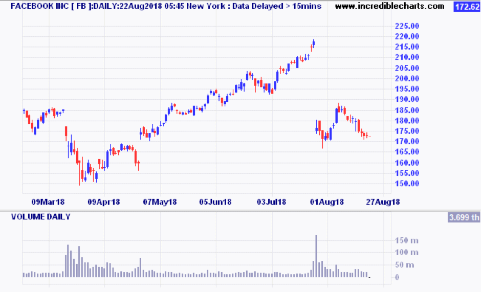
Facebook is now back to where it was a year ago.
Residential property was mentioned earlier in this post, but I don’t want to regurgitate what you are now reading daily in the financial press. It is more useful to read about October 2017 when we said that the Residential property market had likely peaked.
What was interesting during the month was a bulletin from Michael Matusik on the subject of misleading statistics in the property market. He referenced an article by the Urban Developer which ‘revealed’ Australia’s top performing suburbs in the decade 2008 to 2018. In Queensland it was the suburb of Underwood. Yes, Underwood! I know, you are saying ‘what the..?’ Apparently the median price went from $363,000 to $601,000
Michael went on to tear apart the numbers by looking at how many houses had been added as brand new homes, how many of the sales were actually dual-key properties, how many sales recorded in 2018 had undergone extensive renovations, and then looked at same property sales figures for the remaining sample of unrenovated homes that were sold.
The outcome estimated by Mr Matusik on these much more fine-tuned assumptions was around 20% total growth for the decade, which relates to about 1.85% per annum growth. If net rental was say 3.5%, that gives a total return of around 5.35% p.a. Remember, this is for the ‘best suburb’ in Brisbane!
Now I am sure there are plenty of properties that have beaten that by a mile, but this lesson is about not taking property ‘gain’ statistics at face value. Before you jump into any property purchase, look at similar property sales data over the last 10 years, and look for un-renovated samples to get a true feel for the actual ‘passive owner’ returns. The biggest gains in residential property come from uniqueness of position, gentrification of the suburb, and potential for change of use. These factors are generally absent in the kind of property sold by spruikers at Saturday seminars.
If you have concerns about your debt, financial structures or superannuation, or would like to talk to someone about your general financial position, give us a call at Quill Group.
Contact Quill Group today
Get in contact with Quill Group today to discover how we can help you navigate through your finances. At Quill, we are passionate advocates for all of our clients and our team is focussed on providing an experience, not just great service. As the largest multi-disciplined financial services practice on the Gold Coast we provide a high touch personalised service delivered with competence, confidence and amazing results.
The S&P/ASX 200 Accumulation Index had a blinder in June, up 3.27% for the month, continuing the positive trend that started in April. The market has run up 7.33% from the 4th of April low to 30 June. CSL gained 3.6% in June, and was up 39.5% for the year. More on the Growth/Value gap later.
The Australian Real Estate Investment Trust (A-REIT) sector continued to gain over one and three months, with gains of 2.27% and 9.82% respectively. The sector is also cycling to a decent 12 month gain of 13.20%. If that sounds out of synch with residential prices, it is because A-REIT’s had already suffered significant falls over a year ago, and bargain hunters have already been moving in.
| INDEX RETURNS AS AT 30 June 2018 (%) | ||||
| 1 month | 3 months | 6 months | One year | |
| Australian Shares | 3.27 | 8.47 | 4.29 | 13.01 |
| International Shares | 2.40 | 5.82 | 6.66 | 15.96 |
| Domestic Listed Property | 2.27 | 9.82 | 3.02 | 13.20 |
| Global Listed Property | 2.03 | 7.31 | 1.62 | 6.42 |
| Australian Fixed Interest | 0.48 | 0.82 | 1.69 | 3.09 |
| International Fixed Int | 0.17 | 0.15 | 0.06 | 1.85 |
| Cash | 0.15 | 0.49 | 0.92 | 1.78 |
| Market Indices | ||||
| S&P/ASX 200 Accumulation Index | ||||
| MSCI World ex Aust TR Index $A | ||||
| S&P/ASX 300 Property Trusts Accum Index | ||||
| FTSE EPRA/NAREIT DEVELOP NR INDEX (A$ HEDGED) | ||||
| Bloomberg Composite 0 + Years | ||||
| BarCap Global Aggregate Index Hedged AUD | ||||
| Bloomberg Aus Bank Bill Index | ||||
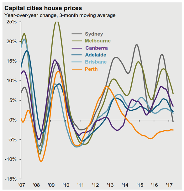
Residential property has continued to decline in the Sydney and Melbourne markets. The NAB Residential Property survey just released indicates a 3.7% decline expectation for Sydney in 2018, and another 0.7% in 2019. The anecdotal evidence would suggest real declines much steeper than that especially in ‘off-the-plan’ apartment re-sales where the property samples are more homogeneous.
International sharemarkets continued higher, in spite of the volatility that spiked in February, with the S&P 500 US index falling 10% in 2 weeks. Global shares for Australian investors gained 15.96% for the financial year, helped along by the Australian dollar which depreciated 3.69% against the USD and 5.80% against the Euro.
In terms of trends, we still see the US Market as being in a positive trend. Although it remains below the January 26 peak, it is building a base after the falls in February and March.
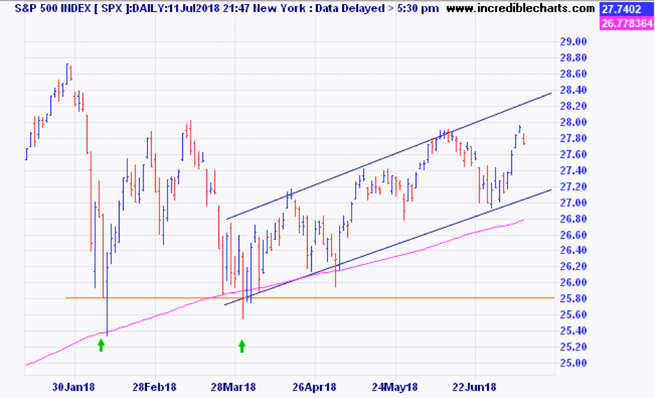
Note the two lows, in early February, and then early April, (shown with two green arrows) where the market found support at 2581 points on two occasions seven weeks apart. Since then the uptrend has been contained within a four percent range, with an upward slope. While the market stays in that uptrend we can only assume that the medium term trend remains positive, in spite of the rapid ramping up of trade war talk.
Turning back to the earlier mention of “Value” versus “Growth” it is very clear that the 2018 financial year was very rewarding for the latter and very difficult if you are a “Value” investor. The charts below from Investors Mutual (full disclosure – IML are a ‘value’ manager) show the divergence between Resources stocks and Industrial stocks over the last year.
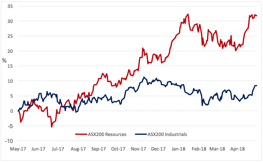
Chart source: IRESS & Investors Mutual
As you can see, if you were not at least ‘index weight’ in Resources (the red line), then you got left behind rather badly, and that is what happened to funds like Investors Mutual Australian shares.
But when you look at the longer term, you see that commodities producers who are generally price takers rather than price makers, have a somewhat less illustrious history.

Chart source: IRESS & Investors Mutual
Over the longer term, Industrial companies have outperformed Resources by a large margin.
Now, the industrials vs recourses comparison is not quite the same as the Value vs Growth argument, but we see similarities. According to research published by Schroders, in most rolling 10 year periods since 1936, the “value” factor (measured as lowest share price to book value) has outperformed the group of stocks with the highest share price to book value by a decent margin. For a look at the graphic representation please click through here: Why Value Investing May Be Primed to Bounce Back
Helping the growth stocks currently is the fascination with the FANG stocks, Facebook, Amazon, Netflix and Google. It is said that those four, along with Apple and Microsoft, contributed 30% of the S&P500 gains through 2017 and the first two months of 2018. For some perspective on these stocks and the risks that are emerging with everyone rushing to the ‘growth’ side of the boat, check out Jesse Felder’s great blog, The Felder Report.
If you have concerns about how well diversified your portfolio is, please give us a call at Quill Group.
The S&P/ASX 200 Accumulation Index rose another 1.09% in May, helped along by a surging CSL which hit its highest ever price. Materials also assisted, with BHP rising 6%. The rolling one year return for the S&P/ASX 200 Accumulation Index is at 9.63%, only beaten by the MSCI World index at 10.37%.
The Australian Real Estate Investment Trust (A-REIT) sector was a star performer over one and three months, with gains of 2.98% and 7.50% respectively. Fears of a rapid rise in rates were overdone in February and March, and the A-REIT’s have bounced strongly from oversold levels.
| INDEX RETURNS AS AT 31 MAY 2018 (%) | ||||
| 1 month | 3 months | 6 months | One year | |
| Australian Shares | 1.09 | 1.08 | 2.81 | 9.63 |
| International Shares | 0.48 | 2.77 | 2.50 | 10.37 |
| Domestic Listed Property | 2.98 | 7.50 | 0.86 | 5.69 |
| Global Listed Property | 2.23 | 7.66 | 0.61 | 4.81 |
| Australian Fixed Interest | 0.69 | 1.18 | 0.68 | 1.67 |
| International Fixed Interest | 0.33 | 0.05 | -0.99 | 1.10 |
| Cash | 0.17 | 0.48 | 0.91 | 1.78 |
| Market Indices | ||||
| S&P/ASX 200 Accumulation Index | ||||
| MSCI World ex Aust TR Index $A | ||||
| S&P/ASX 300 Property Trusts Accum Index | ||||
| FTSE EPRA/NAREIT DEVELOP NR INDEX (A$ HEDGED) | ||||
| Bloomberg Composite 0 + Years | ||||
| BarCap Global Aggregate Index Hedged AUD | ||||
| Bloomberg Aus Bank Bill Index | ||||
Residential property, an unlisted asset with much longer ‘cycles’ from peak to trough is only just starting its decline in Sydney and Melbourne. Back in November 2017 we wrote about our view that residential property in the Southern capitals had likely peaked.
At that point we had no knowledge of what would unfold with the Hayne Royal Commission into misconduct in the banking and financial services sectors. While it has been beneficial in exposing some predatory practices in both banks and financial planning sectors, it is likely to also go down in history as a factor in the 2018/19 property slump.
While reported declines are a modest 4.2% in Sydney compared to May 2017, there is evidence in some pockets of apartment prices being offered at 15% discounts.
There are six headwinds all blowing against residential property right now.
- High levels of existing indebtedness, at average of 189% private debt to income ratios.
- Regulatory pressure to cap the total percentage of interest only loans.
- Higher transaction and holding costs resulting in less appetite from Chinese investors.
- Wages relative to housing costs in Melbourne and Sydney.
- Closer scrutiny of actual household expenditures when assessing loan applications.
- Upcoming election year where the opposition wants to eliminate negative gearing.
To be fair, we also have to acknowledge the tailwinds.
The main thing that comes to mind here is population growth.
According to Michael Matusik there was a total of 142,713 Australian babies born in 2017, but we know they aren’t buying houses. There were also 245,402 new arrivals to Australia, some of whom might be home buyers. About 98,000 of those migrants came to Sydney and obviously they need somewhere to live. But the sceptic would suggest that the majority won’t be able to stump up the cash for a $1,100,000 home.
What about locals moving up while immigrants backfill into the ‘cheaper’ properties? Again, if you look back to the list of headwinds, it seems that wages and credit conditions are unlikely to provide enough fuel to push already expensive prices higher.
The good news is that immigration and natural population growth is unlikely to lead to a twenty-five-year property crisis like they have had in Japan. If you want to see a really scary movie go visit a regional or rural Japanese town and see what can happen when you have a property bubble that coincides with a general decline in population.
If immigration and population growth continues, then we may see the trend of migration to the more affordable regions, helping prices to remain firm. And with lower starting prices, those property markets may well outperform the larger capitals. With thanks to Michael Matusik, I have included a copy of his property sector clock below.
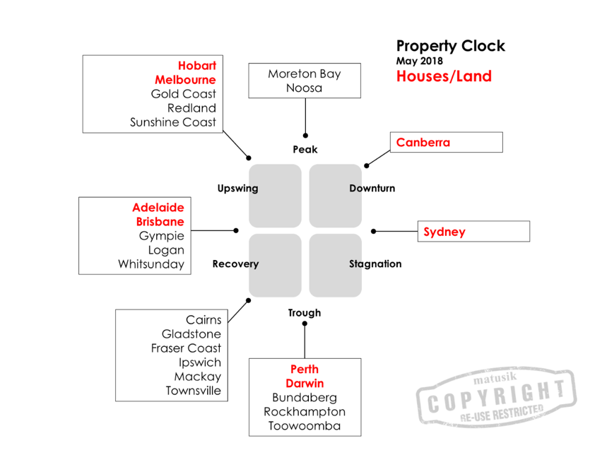
Head to Michael’s site to become a subscriber to one of the most honest property market commentators you will find, and at only $99 a year.
Official cash rates unchanged for the 20th month in a row
Fixed interest. Another month with no change in official cash rates. Some commentators are putting the next rate rise as far away as 2020. Our interest rates are now below US rates for most maturity periods. Although the RBA left official rates on hold, there was a small lift in the Bank Bill Swap Rate during the month. This was off the back of a widening in overseas spreads in the Interbank Overnight rates. Some term deposit rates ticked up by 10 to 15 basis points. Current term deposit rates are around 2.55% for three months, 2.75% for six months, and 2.80% for a year.
A portfolio of investment grade corporate bonds has a running yield of around 3.00% at present. While moving further up the risk spectrum hybrids are yielding a fraction over 5.00% when franking is included.
A first: Tax deduction for Personal Super Contributions
To finish up, just a quick reminder here that this is the first year that employees have been able to claim a tax deduction for their personal super contributions. If you want to do some last-minute tax planning, talk to our experienced team at Quill Group.
The S&P/ASX 200 Accumulation Index rose 3.8% in April, helped along by rising commodity prices, allowing the index to recover from the falls during February and March. All sectors were positive, with Energy (+10.7%) and Materials (+7.4%) the top performers. Financial stocks were flat overall, but AMP (down 19%) took a hammering during the Hayne Royal Commission revelations.
| INDEX RETURNS AS AT 31 March 2018 (%) | ||||
| 1 month | 3 months | 6 months | One year | |
| Australian Shares | 3.91 | 0.34 | 3.37 | 5.46 |
| International Shares | 2.78 | 1.74 | 5.03 | 12.17 |
| Domestic Listed Property | 4.47 | 1.10 | 3.18 | 1.03 |
| Global Listed Property | 2.87 | -1.28 | 0.79 | 3.05 |
| Australian Fixed Interest | -0.35 | 0.79 | 0.86 | 2.16 |
| International Fixed Interest | -0.38 | 0.22 | -0.04 | 1.74 |
| Cash | 0.16 | 0.44 | 0.87 | 1.75 |
| Market Indices | ||||
| S&P/ASX 200 Accumulation Index | ||||
| MSCI World ex Aust TR Index $A | ||||
| S&P/ASX 300 Property Trusts Accum Index | ||||
| FTSE EPRA/NAREIT DEVELOP NR INDEX (A$ HEDGED) | ||||
| Bloomberg Composite 0 + Years | ||||
| BarCap Global Aggregate Index Hedged AUD | ||||
| Bloomberg Aus Bank Bill Index | ||||
Unsurprisingly the Reserve Bank kept rates on hold during the month, the 21st month in a row of no change. The last time the Bank sat on its hands this long was back in 1990. The CPI number for March at +0.40% for the quarter, and +1.9% year on year, is not giving the bank any excuses for an inflation busting increase. In spite of that, longer term interest rates have drifted higher, and that in turn is the cause of the poor returns in the fixed interest returns as shown in the last three lines of our performance table above. As rates rise, the current value of a fixed series of future cashflows will naturally fall. As the table shows, the last year in a benchmark fixed income portfolio returned a best result of 2.16%. One would have done better in term deposits. Our preferred managed funds in the fixed income sector did better on average than the benchmark, through being shorter in duration.
An update on last month’s Financial Market Update
In our last month’s update we spoke about debt levels and how that weighs on the average consumers ability to increase discretionary spending. In our humble view, debt increases beyond the nominal (basically GDP growth + the inflation rate) growth in the economy, are simply bringing forward future consumption into current days. That means consumption later has to be lower, as more of wage earners dollars go into paying off debt. Higher debt simply means stronger headwinds in the future.
The Hayne Royal Commission made headlines throughout the month of April with shocking revelations of mis-conduct not only at the transactional coalface, but right to the highest positions of responsibility within financial institutions.
The irony is, that in spite of all the public cheering of the ‘inquisitioners’ (Rowena Orr received the nickname Rowena ‘shock and’ Orr), the public in two ways are likely to be worse off in the short term, and painfully better off in the long term.
Allow me to explain. First, although the bank lending practices and vertical integration are going to come under more scrutiny following this Royal Commission, it will be bank shareholders who are likely to suffer more than might be gained by improvements to bank practices. Most people don’t think of themselves as bank shareholders, but I would say that 90% of Australians that have a superannuation fund are indirectly bank shareholders. The ‘Financial’ sector makes up 31% of the Australian sharemarket. As such a big sector, it is likely that every large balanced industry or retail superfund is going to have a 30% exposure to Australian shares, and a 31% benchmark exposure puts the net exposure at around 9% according to the back of this napkin. One reason not to indulge in too much schadenfreude.
The second, and potentially much greater impact is from further credit regulation and scrutiny of borrowers. Again, I hear you say, about time! And yes, I agree, for too long the banks have loaned too much to aspirational borrowers who will struggle to repay, and who now have little left over for discretionary spending.
The fall
In January 2018, CoreLogic was forecasting a fall of up to 10% in Sydney house prices. That was before the Royal Commission got going. Rapid housing prices have generally been accompanied by accelerating rates of credit growth in the past. Now that banks are actually going to be checking the real expenses of borrowers to determine their ability to comfortably service a loan, we will most definitely witness a squeeze on credit. Those who once may have been able to borrow $800,000 for a home, might now only stretch to $600,000. Though the impact is not like falling off a cliff, ie; a crash, it does create a negative feedback loop on the way down, just as rising prices create the same upward spiral. Add to that a lot more international scrutiny, and banks themselves will start to experience increased funding costs, which will either squeeze their margins, or push up mortgage rates, or most likely a bit of both.
The agony when your $800,000 investment apartment falls in value to $600,000 will be felt for a lot longer than the joy of seeing bank executives squirming in their collective seats.
The capital and the opportunity to invest in more productive assets
However, every cloud has a silver lining. The Royal Commission may well be a watershed moment in history. Maybe now, instead of leveraging up in residential property, investors might be more attracted to productive investment that requires much less leverage to make a difference. We have world class companies, infrastructure projects and agricultural assets here in Australia that are too often sold off to foreign interests. We have the capital, let’s hope Australian bankers, and Australian investors can get it right and find ways to get money into more productive assets and businesses that take us beyond digging up rocks and building enormous houses.
Beware the Ides of March! The month of March lived up to its brutal reputation that all started on 15 March 44BC when Marcus Brutus stabbed Julius Caesar to death in the Roman Senate. Red ink flowed during March like the blood of Caesar. However, despite the dramatic headlines, markets have merely returned to a normal level of volatility. In fact, 2017 was the unusual year, with its very low volatility. We need to keep some perspective and understand that it is the norm, rather than the exception, to see a 10% correction at some point during any given calendar year. And when you do see that sort of correction, it often makes the 12 month trailing performance look very ordinary, as you can see in the 12 month numbers in our table.
| INDEX RETURNS AS AT 31 March 2018 (%) | ||||
| 1 month | 3 months | 6 months | One year | |
| Australian Shares | -3.77 | -3.86 | 3.48 | 2.54 |
| International Shares | -0.44 | 1.24 | 7.46 | 15.15 |
| Domestic Listed Property | 0.11 | -6.19 | 1.12 | -0.07 |
| Global Listed Property | 2.37 | -5.30 | -1.85 | 1.23 |
| Australian Fixed Interest | 0.84 | 0.87 | 2.32 | 3.28 |
| International Fixed Interest | 0.84 | -0.09 | 0.81 | 2.89 |
| Cash | 0.14 | 0.43 | 0.85 | 1.73 |
| Market Indices | ||||
| S&P/ASX 200 Accumulation Index | ||||
| MSCI World ex Aust TR Index $A | ||||
| S&P/ASX 300 Property Trusts Accum Index | ||||
| FTSE EPRA/NAREIT DEVELOP NR INDEX (A$ HEDGED) | ||||
| Bloomberg Composite 0 + Years | ||||
| BarCap Global Aggregate Index Hedged AUD | ||||
| Bloomberg Aus Bank Bill Index | ||||
Australian shares appeared to be the worst of the asset classes, but in local currency terms most global markets had similar falls. The German DAX index was down 2.73% and down 6.35% over three months. The S&P500 index of the top 500 US companies was down 2.54% for the month. The reason why global shares are showing less of a fall in our table above is due to the currency translation. With the Australian dollar seen as a ‘commodity’ currency, it has a tendency to rise when global growth is going well and fall when investors revert to ‘risk-off’ mode. That creates a natural ‘shock-absorber’ which makes un-hedged global sharemarket exposure a good diversifier to Australian shares.
While we still have a view that global growth will be robust and synchronised this year, meaning equity market declines should be modest, it must be said that this growth is still fragile. The fragility arises from global debt levels, and the desire for central banks to ‘normalise’ their balance sheets that are bloated with government debt. Japanese government debt is monstrous. Even with rates of close to zero, they currently spend 24% of government revenues on debt servicing. The USA, which is well into an economic upswing, is still running deficits, recently expanded by the Trump tax cuts. By 2020 the US will have $25 trillion of debt, and assuming average interest rates of only 2.00% they will spend 25% of government revenue servicing that debt!
We mention this debt load, not with the concern, ‘how are we ever going to pay this off’, because the truth is governments, like corporations, never fully pay off debt. It makes sense for both governments and companies to maintain a certain perpetual level of debt. No, we mention the debt load because of the view that the quantum of government debt will provide a huge incentive for central banks to move with caution to avoid a dramatic increase in bond rates, which in turn impacts on the debt servicing costs of governments as they re-finance existing debt as it matures.
At the same time, consumer debt is also very high, and nowhere more so than here in Australia. One might have thought that after the GFC, households would have gradually reduced overall indebtedness. Not so. The chart below shows how after a pause for the 3 years after 2008, we went right on accumulating ever more debt at an aggregate level.
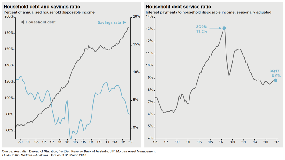
All of that debt growth helped to fuel further property price increases, aided and abetted by ultra low interest rates. This was particularly pronounced in the period 2012 to 2017.
Source: JP Morgan & RPD CoreLogic
Rising property prices has a positive wealth effect on the psyche of humans, and so borrowing more to join the band wagon seemed like the natural thing to do.
Subtly however, the month of March 2018 saw the year on year rate of change for Sydney house prices falling into the negative territory, with rates of change elsewhere also trending lower.
Clearly the debt and property discussion is somewhat off topic from the sharemarket falls that we started this article with, however all markets are subtly interlinked. It isn’t always obvious what the link is, but we naturally look first at the global picture in order to formulate our localised investment preferences.
The biggest of big pictures sits in the global debt and central bank decisions. From there flows interest rate outlooks. At present the unprecedented levels of government debt have us believing that there will be a tendency by central bankers to tolerate slightly higher levels of inflation before pushing rates up dramatically. This in turn indicates that rates overall remain low, and from that we get minimal inflation adjusted returns on debt securities. From that backdrop it is probable that investors keep buying the dips in equity markets this year, as they find the alternatives un-attractive.
The month of February finished up being almost flat, a surprise after the deep selloff early in the month.
Listed property, (local referred to as A-REIT’s and global as G-REITs) was down again on the rising interest rate curve. Although one never wants to stand in front of a freight train the value now emerging in listed property starts to look interesting at these levels. The longer term outcome will depend on bond yields.
Bonds are in the spotlight as a leading culprit in the increased volatility and the sell-off in the aforementioned A-REITs. The ten year US bond yields that we discussed at length in last months post continued to rise, peaking at 2.94% on 21 February. The yields appear to have run into some resistance at that level, but this could be merely a consolidating pause.
During the month, the S&P 500 index of US shares had a loss of 11.83%, which takes it into the ‘correction’ territory. Although shares have rallied back strongly – up 7.7% in the 11 days after the mid month low – it is clear that the very benign conditions of 2017 have changed. If this market correction is not over, (and frankly, 9 days is not a very long correction in the scheme of things) there is a technical symmetry that would make 2490 a logical target. This is based on the second leg down being the same length as the first. At that point the decline would be a 13.3% downturn from the January high, and take us back to levels seen in September 2017.
Rather than being concerned about volatility, if investors have the correct time horizon, and adequate liquidity, it should be viewed as an opportunity to put more capital to work in selected areas.
In the Australian markets, the decline lasted a little longer in time, but not as deep as the US falls. After a peak at 6135 on January 9, the market fell to a low of 5820 on February 12. That peak to trough fall was only 5.13%.
The following chart from JP Morgan gives an excellent perspective on how to react to any volatility that we experience this year.
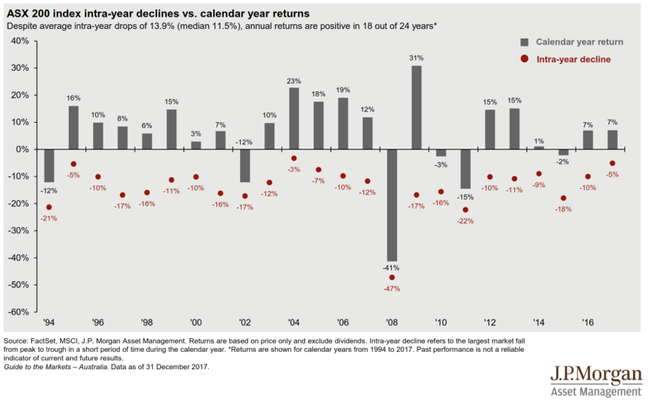
Only 5 out of the last 24 years have seen a peak to trough loss of less than 10%. Last year was one of those years, with unprecedentedly low volatility. We have to keep historical perspectives in mind to be successful investors.
Last month we posted the view, “…we believe the market will find a bottom sometime in the next month or two, and then continue to grind higher over the course of the year”. That outlook could be derailed by the current tariff bombshell that Trump has dropped into the midst of world trade. But that only reinforces our view that you need to be actively managing positions at this point in the cycle and not accept index weights in either stocks or interest rate duration.
For more information please talk to your Quill Group adviser.
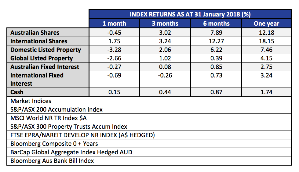
The month of January was relatively benign. Australian shares fell a little, and with the falling Australian dollar, international shares did fairly well for the month. Below we publish the 12 month rolling returns. Listed property, (local and global), was down on the rising interest rate curve.
The real story that everyone wants to know about is, what happened in the first week of February, and what does that say about the rest of this year – and indeed the stock market outlook? First up, it is worth taking a look at the charts to visualise what happened.
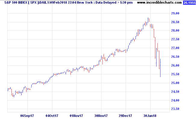
In the US market, the best index to watch is the S&P 500 Index.This is a much broader measure of stock prices, covering the 500 largest companies, versus the oft quoted Dow Jones Industrial Average (DJIA) which covers only 30 stocks, and is measured by assuming ownership of one share of each company, adjusted for splits and additions (it’s complicated).
Anyhow, from the high on Friday 26 January, to the intraday low on Friday 9 February, the S&P 500 lost 11.83%. (In the same period the Australian market was -4.36%) A 10% fall qualifies as the first ‘correction’ of the year, and follows a very benign 2017, when the steepest peak to trough loss for US shares was in the order of 3%. In the space of 10 trading days, all of the gains of the last two months were reversed. In that context, it is actually no big deal. Traditionally we expect a peak to trough loss of at least 10% in most years. This year it just happened early, happened fast, and followed a long period of stable markets, where complacency had become widespread. In fact, 2017 was so stable, in Australia we had the lowest number of daily moves of +/- 1.00% since 2004.
The real story behind this decline (aside from the usual finger pointing at algorithms, and portfolio insurance) is the rapid rise in the US long term interest rate curve. Below we show a six month chart of the US ten year bonds yields.
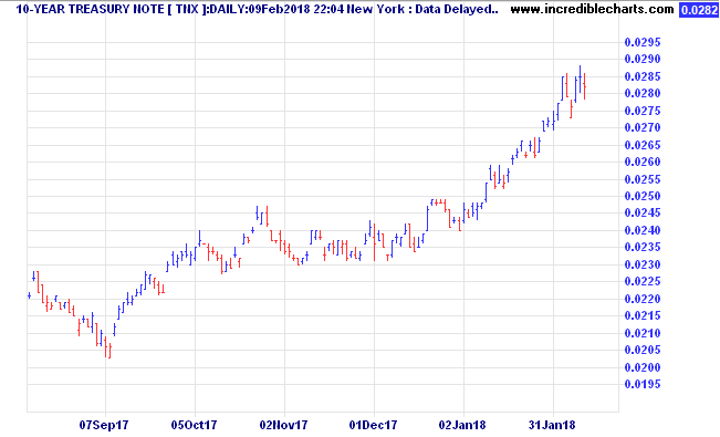
Notice that during January, the US Ten Year bond yields were accelerating up out of the 2.4% to 2.5% range, towards 2.85%. The rot started to set in on Friday 2 Feb, when the yields jumped from 2.78% to 2.85% on the positive US jobs report. Note that important point. Good news is bad news! IE; economy improving, jobs up, but that theoretically brings inflation and wages growth, and higher borrowing costs.
At present, rising bond yields combined with falling stock prices are a double whammy for what was once a staple of investing, the 60/40 portfolio where 60% was in shares, and 40% in bonds. With lifetime low yields we at Quill Group have been positioned to avoid long interest rate duration in the bond (fixed interest) part of our portfolios. While on the topic of bond yields, it is worth taking a look at the last 30 years of US Ten Year bond rates.
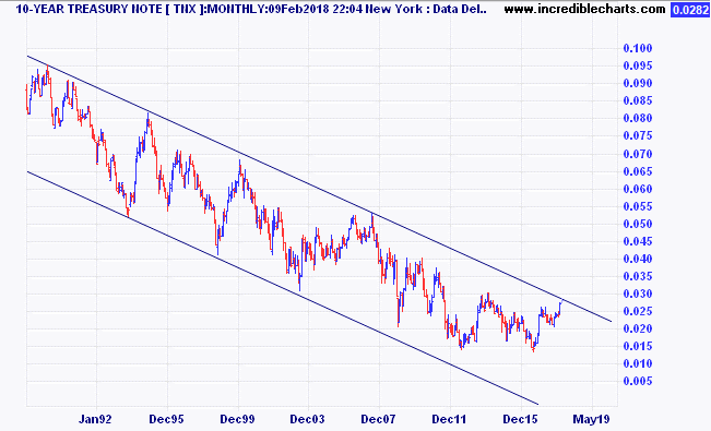
Note the clear downtrend channel that we have been in since 1982. (chart data is since 2000, but the peak was in 1982).
It is very important to understand the effect those falling interest rates over 35 years have had on asset prices. Now we appear to be on the cusp of breaking out of that downtrend. As you might well realise, this is potentially a very important juncture in history. It is for this reason that we think that volatility has made a violent return. It’s not every day that 35 year trends reverse! Higher interest rates mean valuation models are readjusted to take into account that the risk free rate of return (generally accepted as the ten year government bond rate of the country of the asset being valued). When the risk free rate is higher, the rate of return required to take equity risk is also higher. If cashflows (profit) cannot also be expected to rise (will the higher interest rates undermine any improvement in top line through an improving economy?) then the current value of those future cashflows gets marked down.
So, what does this ‘correction’ portend? Is it just a ‘cleansing pause’ or the start of a longer term decline? To be honest, no one can know for certain. Yes the talking heads will strongly argue whatever is their view. The vested interests will tell you to stay the course. The conspiracy theorists will say this is the beginning of the end.
What we do know is this. Returns going forward are likely to be lower than in the past. Our outlook for benchmark equity indices over the five to ten year horizon is well short of double digits. To get a double digit return we believe you will need to employ active management at a stock level, and an asset allocation level – which is something we seek from our investment partners.
So, what is the most likely outcome? As mentioned, valuations are elevated compared to history. However, we don’t see enough pent up demand from consumers or tight enough labour conditions to see inflation becoming a real problem yet.
Bear markets, which are defined as a market decline of 20% or more, are normally accompanied by a recession.
In that respect, global growth is on track to be more synchronised this year than in any of the last 36 years. In the US, they are looking forward to lower corporate taxes, and the spending on wages and investment which should follow. Indexes of purchasing managers intentions in all the major regions are nowhere like indicating any sort of slowdown in the economy.
The yield curve is also an early warning signal of a recession. Leading into the last seven recessions in the USA, the ten year bond yield has dropped below the two year bond yield every time.
Today the bond yield is certainly flatter – but is not yet near an inversion. The current US two year bond yield is 2.07%, and the ten year is 2.85%.
The chart below from JP Morgan illustrates the ‘gap’. If history is still a guide to the future (and granted, it may not be) the peak in this bull market may still be more than a year away.
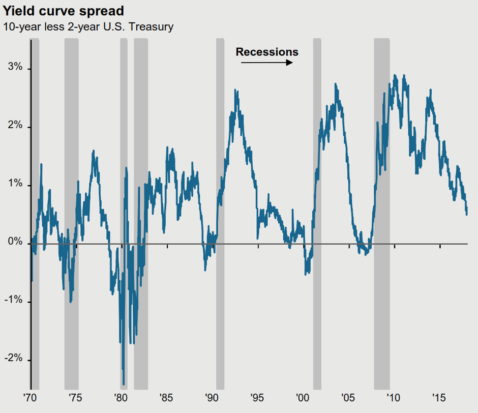
The same source, (JP Morgan) also points out that the average time from ‘yield curve inversion’ to stock market peak is 10 months. The shortest period was 3 months (in 1980) and the longest was 19 months (in 1988).
In the USA, over the last 90 years, there have been 10 bear markets (falls of greater than 20%). Eight of those were accompanied by recessions. Only the ‘flash crash’ at the time of the Cuban Missile crisis in December 1961, and the famous ’87 crash had no ‘recession’ trigger. Although painful, (1962; -28%, 1987; -34%) they were short, both over within 6 months.
Given the history, and that we see no recession triggers on the horizon at present, we believe the market will find a bottom sometime in the next month or two, and then continue to grind higher over the course of the year.
However, it is also impossible to completely discount the risk of a deeper flash crash, especially with central banks looking to end their massive liquidity injections.
As a result we caution against being too aggressive on buying the dips, and also warn against over-leverage in these conditions. A portfolio with well thought out diversification across the major asset classes as well as alternatives, will still deliver the best results in the medium to long term.
The month of December capped off a great year for investment markets. Good returns with unusually low volatility provided ‘many happy returns’ for balanced and growth investors.
Australian fixed interest turned in a negative return, as longer term rates rose during the month. A widely expected rise in the US Federal Reserve rates pushed their Fed Funds rate up to 1.5%, the same as the Australian Official Cash Rate. The only negatives for the major asset classes for the month of December were International Shares, and Australian Fixed Interest. In fact, international shares were mostly positive in December, but the 3.0% rise in the Aussie dollar turned those gains into a negative return for the month.
On the currency front, the strong Australian dollar was in fact more about the US dollar which weakened by 10% versus a trade weighted basket of currencies over the 2017 year. This is a perverse outcome very few would have predicted given the US central bank was just about the only major global central bank raising rates during the year. (Hat tip to Larry Jeddeloh from The Institutional Strategist who did make the correct US Dollar call)
Australian equity market valuations end the year higher than historical averages, but with potential to push higher, which we will discuss in our 2018 Markets outlook.
The chart below provides some history of the Australian sharemarket forward Price to Earnings (P/E) ratio.
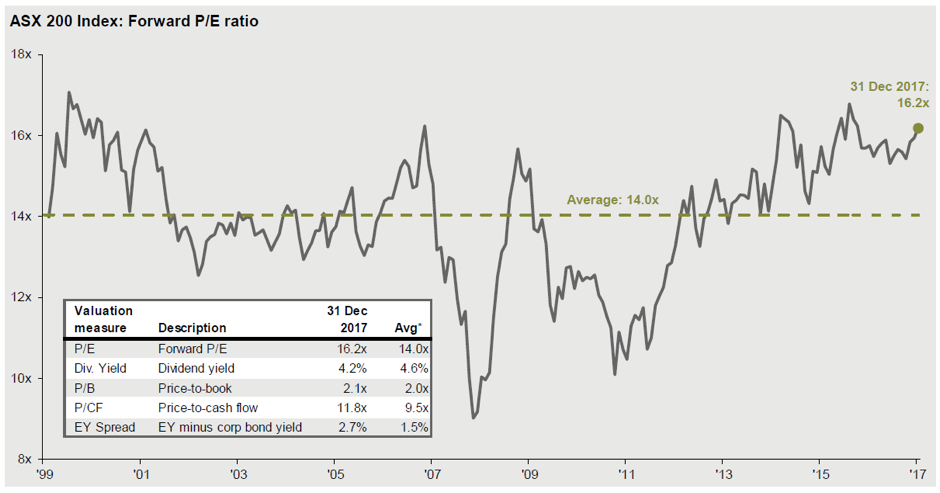
Source: JP Morgan – Guide to Markets
We are pushing into the same valuation territory as prior market peaks, albeit with much lower comparative interest rates at present. While not suggesting any imminent crash, it is important to understand that outsized gains in widely held asset classes are normally followed by lower than average gains in future.
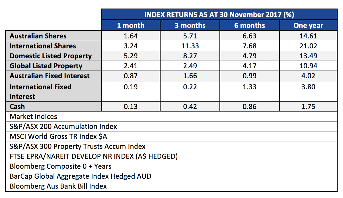
The S&P/ASX200 Accumulation has now put in two solid months, following the October gain of 4.01% with another 1.64% in November. Twelve month returns are 14.61%, almost double our expected annual 12 month returns of around 8.5%. This surge may have pulled forward some of the next twelve months expected gains.
Global Markets
Global markets also posted a good month, with gains of 3.24% and three month gains now at 11.33%. Emerging Markets, which we have favoured in our Managed Portfolios, are up 29.27% over the last year. We mentioned in the last update that Emerging Markets remain somewhat cheaper than developed markets, with arguably more to gain from structural reforms and demographic changes.
Real Estate Trusts
The A-REIT sector (real-estate trusts) saw gains of 5.29% for the month of November. This sector is coming back into favour after a sell-off based on concerns about higher bond rates and the arrival of Amazon which may (or may not) further hollow out the Australian retail sector.
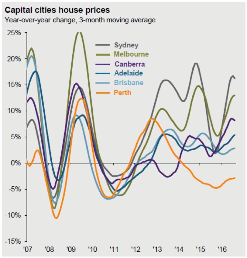
Real estate has many different sub-sectors and geographical differences, so please don’t mistake our view of fair value in parts of the A-REIT sector for any kind of enthusiasm about residential markets. We think it is fair to assume that for the most part the residential sector has peaked, and that is well illustrated in this chart from JP Morgan and CoreLogic.
Bond Markets
Bond markets remain one of the conundrums in the investment world. With rates at lifetime lows, and very little carry (income) in the highest grade government bonds, the diversification benefits of bonds are very much diminished. Studies from JP Morgan have shown that as bond yields fall below 4% the correlation of bonds and equities rises to above zero. For diversification benefits, you ideally want to add assets that have a negative correlation. Compounding the problem is that interest rates, while still subdued, are drifting higher, albeit at a slow pace, which creates a drag on returns from the typical long duration bond portfolios. Our preferred exposures in this sector are high grade corporate debt with short maturities, or active bond managers who can vary duration according to their outlook.
Official Cash Rate
The Official Cash Rate as controlled by the Reserve Bank, and affecting term deposit rates, doesn’t appear to have much potential for increasing in the next twelve months. We do have some concerns that if US rates do continue higher, with the expected 3 or 4 rate rises in 2018 while Australian rates remain unchanged, the downward pressure on the AUD will continue, creating some inflation in tradeable goods.