


The January Effect. Can it predict where the market is going? Is there a better indicator we should watch?
In the early days of 2017, plenty of journalists were dusting off their old “January Effect” stories. Give it a tune up, add some new stats, and there you go, a half page story without too much effort…
So, what is this January Effect?
Let’s start with the general thesis. January is often a good month in US stockmarkets. The US tax year ends on 31 December, so you can get a lot of tax loss selling in December pushing prices down, followed by renewed buying of those dumped stocks in the first five days of January. The market moods seem to be set early in January, and the price action during the full month sets a positive or negative tone for the year. Standard and Poors data shows that since 1929, the direction over the month of January has correctly indicated the direction for the rest of the year 73% of the time. In other words, when markets were up in January, the market was up nearly three out of four years. And if the first five days were up, then the market finished up 86% of the time, for an average gain of 14%.
So that looks like a good trade! The S&P 500 was up 1.3% in the first five days, and up 1.7% for the month. Looking good so far.
But how did Australian investors fare?
Well, the rise of the Australian dollar had a nasty impact on international shares. The US S&P 500 index, converted back to Australian Dollar (AUD) was down 2.8% thanks to the 5.3% rise in the AUD (dividends cushioned the blow somewhat).
The broader Morgan Stanley Capital Index (MSCI) of global shares declined 2.29% during January. Our local ASX200 index was -0.79% while smaller companies fell 2.4%. No joy in listed property trusts (A-REITS) which were -4.71%
So the January Effect gets a bit murky. Do you rely on the US dollar version? Does the January effect make us worried about Australian shares? The truth is, anything can happen. Previously observed events can lose their efficacy if too many people become aware of the probabilities. It really is not something that investors should put too much store in, just as they shouldn’t fear the month of October.
But what can we learn about history and negative market moves?
An interesting chart we wanted to share this month comes from JP Morgan.
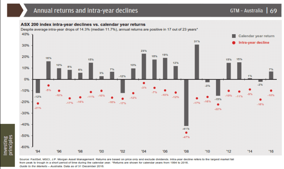
This chart shows intra-year peak to trough declines as red dots, and the full calendar year Australian share market returns in the grey bars. (If it’s a bit blurry, just email your adviser for the full copy)
What we observe is that over the 23 years, the median intra year decline has been 11.7%, while the average has been 14.3% thanks in part to the big crash in 2008.
If we were to look at market declines as a ‘buying opportunity’ for any cash we have on the sidelines rather than a cause for panic on the existing stocks we hold, it could add significantly to our overall returns.
So let’s set the scene then for where that ‘buying zone’ might be in 2017.
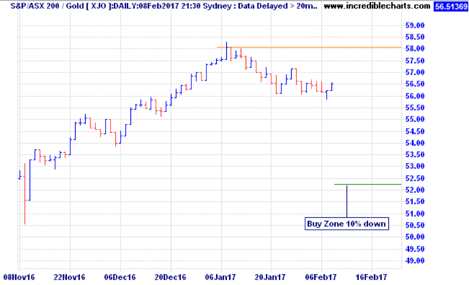
So far the market high this year has been 5807 points as measured by the ASX200 on the 9th of January. A 10% decline from that level would take us down to 5226 points. That degree of decline has odds of at least a 74% chance of happening based on the last 23 years. So don’t fight it, embrace it. And what if it doesn’t come this year? Don’t worry, there’s always next year! The only time we had two back to back years with less than a 10% decline was 2004 and 2005 when markets were much cheaper than today.
Happy investing!